Planning Guides, Style Guide
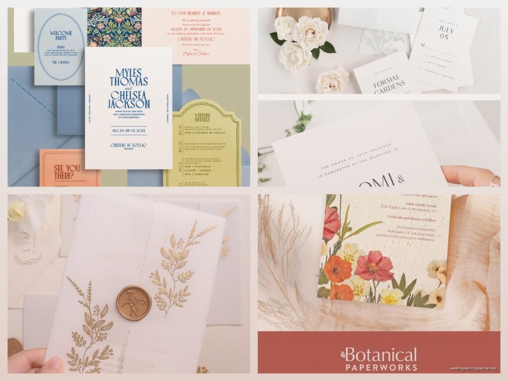
Best Paper for Wedding Invitations: Card Stock Guide
Jun
Okay so card stock weights are honestly the most confusing part
The first thing you gotta know is that paper weight is measured in pounds (lb) or GSM (grams per square meter) and like… nobody explains this clearly. I had this bride back in spring 2023 who kept insisting she wanted “heavy paper” and when I showed her 130lb cardstock she was like “this feels flimsy” because she’d been comparing it to chipboard or something. It was a whole thing.
Here’s what the numbers actually mean: when you see something like 80lb cover stock, that’s the weight of 500 sheets at a specific standard size. The problem is that different types of paper have different standard sizes so an 80lb text weight and an 80lb cover weight are totally different thicknesses. I know. It’s annoying as hell.
For wedding invitations, you’re pretty much always looking at cover stock, not text weight. Cover stock is the thick stuff. Text weight is what you’d use for like… the tissue paper inserts or direction cards maybe.
The actual weights you should care about
For the main invitation card itself, I usually recommend between 80lb and 130lb cover stock. That converts to roughly 216-350 GSM if you’re looking at European papers or fancy imported stuff.
80lb cover (216 GSM) is kinda the minimum. It feels substantial enough that it doesn’t seem cheap, but it’s not gonna wow anyone. This is what I use for response cards usually because those don’t need to be super thick and you want them light enough that the whole suite doesn’t cost a fortune to mail.
100lb cover (270 GSM) is like the sweet spot for most invitations. It’s thick enough to feel quality, it prints beautifully, and it’s not so heavy that you’re paying extra postage. This is what probably 60% of my clients end up using.
110-130lb cover (300-350 GSM) is when you’re getting into luxury territory. The paper feels almost like a thin cardboard, which sounds bad but actually feels really premium. I had a client who did 130lb cotton paper with letterpress and honestly I wanted to frame one because it was so gorgeous. But you’re definitely paying more for printing and postage.
Anything over 130lb is… okay look, I’ve seen it, but unless you’re doing some specific artistic thing or you have an unlimited budget, it’s probably overkill. At some point it starts feeling less like an invitation and more like you’re mailing someone a coaster.
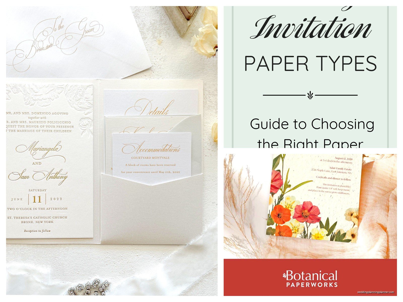
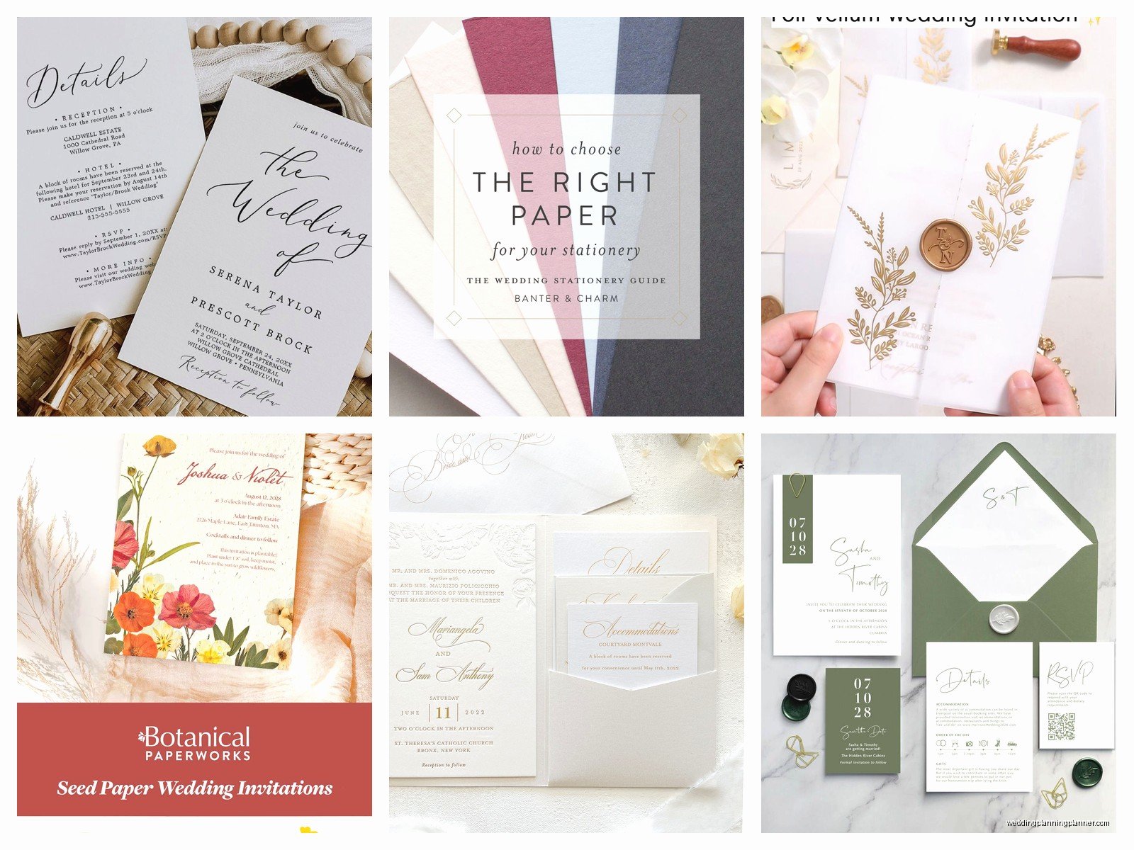
Different paper types and finishes
So weight is one thing but the actual paper composition matters way more than people think.
Cotton cardstock is my favorite and I’m gonna sound like a snob but once you feel 100% cotton paper you kinda get it. It has this soft texture that’s hard to describe — not fuzzy exactly, but there’s a tactile quality that screams expensive. Crane’s is the classic brand here. It takes letterpress beautifully because the fibers compress in this really satisfying way. The downside is that it’s pricey and it doesn’t work great with every printing method. Like if you’re doing digital printing with a lot of ink coverage, sometimes cotton paper can’t handle the moisture and it warps or the colors look muddy.
Regular wood pulp cardstock is perfectly fine and honestly most people can’t tell the difference unless they’re comparing samples side by side. It’s cheaper, it prints consistently, and you have way more color options. Neenah and Mohawk make really good quality stuff. The ultra-white smooth finishes are great for modern designs with lots of color.
Linen cardstock has that textured finish that looks kinda traditional and expensive. I see a lot of classic wedding invitations on linen. It photographs well because the texture catches light, but be careful with small text or intricate designs because the texture can make details harder to read.
Laid finish has those horizontal lines running through it — very vintage library vibes. Either you love it or you hate it, there’s not much in between.
Metallic and pearl cardstock can look amazing or cheap depending on how you use it. I did this whole suite last year with a champagne shimmer cardstock and it was stunning, but I’ve also seen some bad metallic papers that look like craft store supplies. Stardream is a good metallic line if you’re going that route.
What actually annoys me about paper shopping
The thing that drives me crazy is when paper companies don’t send adequate samples or they only show you like a 2×3 inch swatch. How am I supposed to know how a full 5×7 invitation will feel from a tiny corner piece? I always tell clients to order full-size samples even if it costs a bit extra because you need to see how the paper actually behaves at the right size.
Also — and this might just be me — but I hate when people call all thick paper “cardstock” interchangeably. Like no, there’s a difference between cardstock and cover stock and chipboard and posterboard. They’re not the same thing even though they’re all thick.
Matching your paper to your printing method
This is where people mess up all the time. You can’t just pick a pretty paper and then decide on printing later, they have to work together.
Digital printing works on basically anything. It’s the most flexible and usually the cheapest option. You can do it on smooth or textured paper, cotton or wood pulp, whatever. The colors can be really vibrant. But if you’re using really thick paper like 130lb, make sure your printer can actually handle it — I’ve had printers jam on super thick stock.
Letterpress needs soft paper to work properly. That’s why cotton is so popular for letterpress invitations. The press literally pushes metal type or plates into the paper, so you need paper with fibers that will compress and create that debossed impression. If you try to letterpress on coated or super hard paper, it just doesn’t work the same way. Also letterpress generally looks best with less ink coverage, so if your design is like a full color photograph… maybe reconsider or go with digital.
Thermography (that raised printing that kinda looks like engraving but isn’t) works best on smooth uncoated paper. The powder needs to stick to the ink and then melt, so textured papers can be tricky. It’s cheaper than engraving though and most people honestly can’t tell the difference.
Foil stamping is having a huge moment right now and it works on most papers but looks especially good on darker cardstock. Like navy or black cardstock with gold or rose gold foil? So pretty. But you need enough paper thickness to handle the heat and pressure — I wouldn’t go below 100lb cover for foil.
Engraving is the fancy traditional method where the paper is actually pressed into an engraved plate from behind. It creates this raised print on the front and you can feel the debossed imprint on the back. It needs thick sturdy paper, usually at least 100lb but preferably heavier. Cotton paper is traditional for engraving.
Color considerations that nobody tells you
White isn’t just white. There’s bright white, natural white, soft white, ecru, cream, ivory… my cat knocked over my sample box once and I had like fifteen different whites scattered across the floor and I honestly couldn’t tell some of them apart.
Bright white or ultra white is that crisp clean white. It makes colors pop, especially if you’re doing modern designs. It can look a bit stark for traditional weddings though.
Ecru and ivory are warmer, more vintage-feeling whites. They look classic and elegant but your colors will print slightly differently on them because of the warm undertone. If you’re trying to match specific brand colors or you need precise color accuracy, stick with bright white.
Colored cardstock is tricky because you have to think about what you’re printing on top of it. Dark colors look dramatic but you’ll probably need white ink for text to show up, which adds cost. Light pastels can be really pretty but sometimes they photograph weird — I had a lavender invitation that looked gray in every photo the bride took.
The whole deckled edge situation
Okay so deckled edges are those rough torn-looking edges and they’re very trendy right now. They look handmade and artistic. You can buy paper that comes with deckled edges or you can have them created by tearing against a ruler or using a deckle edge ruler.
Here’s the thing though — deckled edges are harder to work with for layered invitations. If you’re doing like a vellum overlay or you want to mount your invitation on a backing card, the uneven edges make it complicated. Also they can get beat up in the mail more easily than cut edges. I still love the look but just know what you’re getting into.
Practical stuff about postage and mailing
This is gonna sound boring but you need to think about it: the weight and thickness of your paper directly affects your postage cost.
A standard wedding invitation can usually mail with a regular forever stamp if it’s under 1 oz and meets size requirements. But once you start adding thick cardstock, multiple inserts, ribbons, wax seals, whatever… you’re looking at additional postage. And if your invitation is thick enough that it doesn’t bend easily, it becomes “non-machinable” which means extra fees.
I always tell people to make up one complete invitation with all the layers and inserts and everything, then take it to the post office and have them weigh it and tell you the actual postage. Don’t guess. I had a bride in summer 2021 who mailed 150 invitations with regular stamps and like 80 of them got returned for insufficient postage. It was a nightmare.
Also square invitations are soooo pretty but they cost extra to mail because they’re not standard sizes. Just FYI.
Where to actually buy cardstock
If you’re DIYing, Paper Source and Cards & Pockets have good selections and you can order samples. LCI Paper is great for bulk orders. Neenah and Mohawk sell through distributors so you might need to find a local paper supplier.
For pre-cut invitation sizes, Cards & Pockets and Paper & More are reliable. They have tons of colors and weights already cut to standard sizes like 5×7 or A7.
If you want really fancy stuff, check out Legion Paper. They carry a lot of specialty and imported papers. French Paper Co. has amazing colors and their paper quality is consistently good.
Etsy actually has some good paper suppliers too, especially for smaller quantities or unique colors. Just read reviews carefully because quality can be inconsistent.
Testing before you commit
I cannot stress this enough: order samples and do test prints. What looks good on a screen might look completely different printed on actual paper. And different papers absorb ink differently, so your colors might shift.
Get samples of at least 2-3 different weights in your preferred color. Print your design on all of them. Look at them in different lighting — natural daylight, indoor lighting, evening. Show them to someone whose opinion you trust. The paper you think you want might not actually be the best choice once you see it in person.
Also print a full invitation suite mock-up and assemble it completely. See how it feels in your hand. Try stuffing it in the envelope. Does it fit easily or is it a tight squeeze? Does the envelope flap close properly with all the inserts inside? These practical considerations matter just as much as how pretty the paper is.
Some random tips I’ve learned
Humid weather affects paper, especially cotton cardstock. If you’re printing or assembling invitations in summer, keep the paper in a climate-controlled space or it might warp.
If you’re doing belly bands or ribbon, thicker paper actually works better because it’s more stable. Thin paper can buckle under the pressure.
Laser printers handle thick cardstock better than inkjet printers usually, but check your printer specs. I killed an inkjet printer once trying to run 130lb cardstock through it repeatedly.
If you’re printing at home and the paper keeps jamming, try feeding sheets one at a time instead of loading the tray, and make sure you’ve adjusted your printer settings for the paper thickness.
Store extra cardstock flat in a cool dry place. Don’t lean it against a wall or it’ll warp over time.
If you’re combining different papers — like a cotton invitation on a metallic backer card — make sure the weights complement each other. A super thick backer with a thin invitation looks weird, but a thick invitation on a slightly lighter backer can look really elegant and… wait I’m getting into design territory when this is supposed to be about paper specs.
The point is there’s no single “best” cardstock for wedding invitations. It depends on your design, your printing method, your budget, and honestly just what feels right to you. I’ve seen beautiful invitations on 80lb paper and I’ve seen mediocre invitations on 130lb cotton. The paper quality matters but it’s not everything.